DEBTOR DASHBOARD
- 1. INTRODUCTION
- 2. WIDGETS
- 3. LINE CHART
1. INTRODUCTION
Debtor dashboard is where the user can get the quick and simple updates on any basic but important information regarding to company’s performance such as the most recent sales and collection. Basically all the information can be clicked to drill down and lead user to the more details screen. The screen is a quick and easy way to display the debtor information for the user.
2. WIDGETS
• Sales
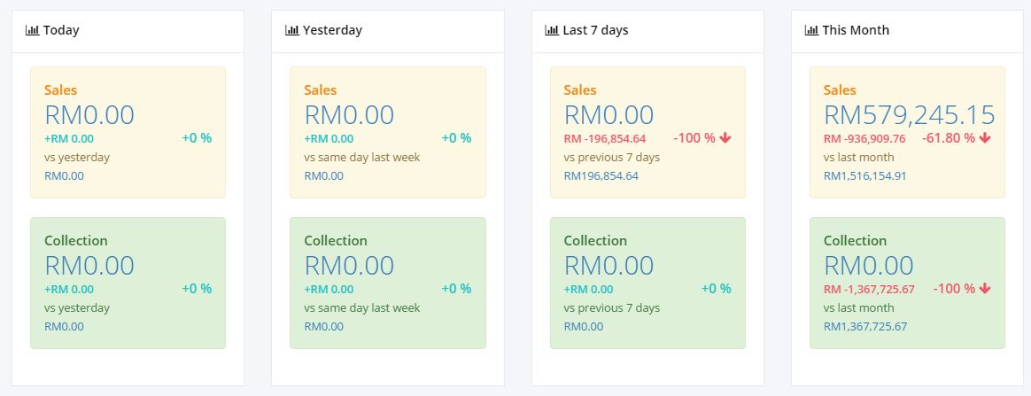
The yellow area shows the figure for the sales for: TODAY, YESTERDAY, LAST 7 DAYS AND THIS MONTH. That small figure in the second line shows the amount of any changes to the sales value compare to: Yesterday, Same day last week, previous 7 days and last month. The percentage value in the second line on the right side shows the percentage on the changes in sales, and the value could be positive (+) which means there is increase in sales, or negative (-) which shows the decrease in sales for the current week. The figure at the bottom is the value for the previous sales.
• Collection
The yellow area shows the figure for the collection for: TODAY, YESTERDAY, LAST 7 DAYS AND THIS MONTH. That small figure in the second line shows the amount of any changes to the collection value compare to: Yesterday, Same day last week, previous 7 days and last month. The percentage value in the second line on the right side shows the percentage on the changes in collection, and the value could be positive (+) which means there is increase in sales, or negative (-) which shows the decrease in collection for the current week. The figure at the bottom is the value for the previous collection.
3. LINE CHART
• Yellow Area
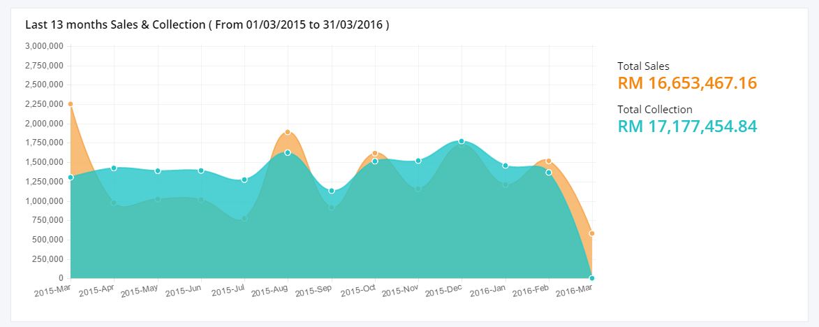
The yellow area shows the figure of the last 13 months sales. The points connecting the data shows a continuous change of total sales throughout the last 13 months. This line graph makes it easier for user to compare between different sales values. The horizontal lines indicates the months and the vertical line shows the sales figure. The dot represents the value of sales for the current month.
• Green Area
The green area shows the figure of the last 13 months collection. The points connecting the data shows a continuous change of total collection throughout the last 13 months. This line graph makes it easier for user to compare different collection value, situations, and information. The horizontal lines indicates the months and the vertical line shows the collection figure. The dot represents the value of collection for the current month.
4. LINK TO DOCUMENT LIST
• Clicking on the figure in the widget and line chart will direct user to the Document List details as follows:
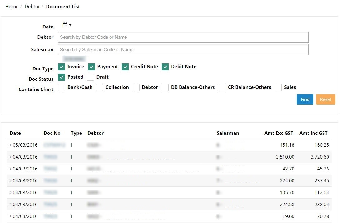
(Further explanation on this screen will be described in ‘Document List’ section)